The Guest Cottage in the Woods
Thrifted table and antique family heirloom chairs.
For my inaugural blog post, I’m sharing this wonderful budget remodel of a guest cottage! First a little background on this project, which is actual very special to me. Though I went to college in my hometown, I had always lived in the dorm, to have the full college experience. However, toward the end of my junior year, I asked my parents if they would be interested in putting the cost of living in the dorm my senior year toward building an “over the garage studio apartment” situation that I could live in, and then they could have in the future to host guests. They were enthusiastic about the idea, and with the help of family and friends that summer and fall, and a lot of work between the three of us (that was the first time my dad taught me how to wire an outlet and insulate a wall), we made it happen. By November of my senior year I moved in and thought having my own space across the yard from my parents was the coolest. I graduated in 2002, and my parents still use the space for visitors including me when I stay the night.
This summer I had another proposal for my parents. After 20 years the apartment was ready for some updates. Could I design a budget refresh for them? They said “yes!” again and we got to work.
Apartment before.
Apartment before.
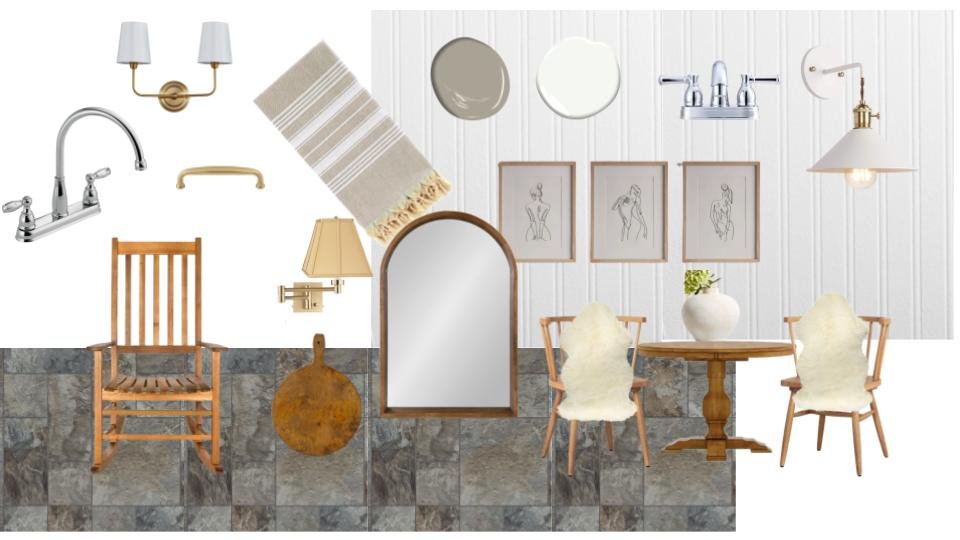
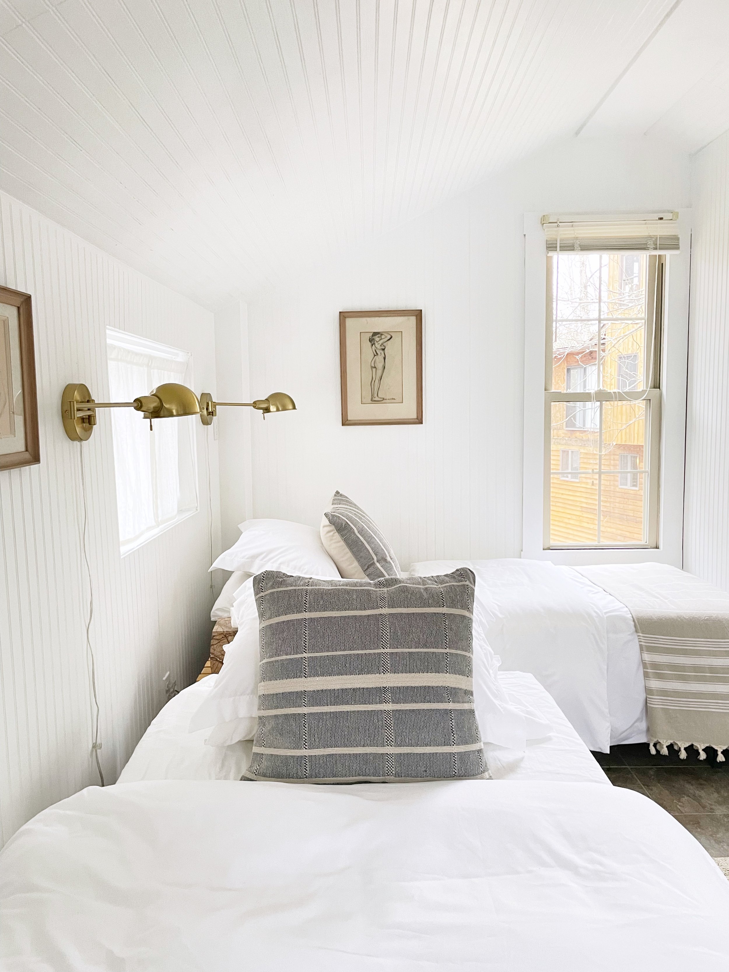
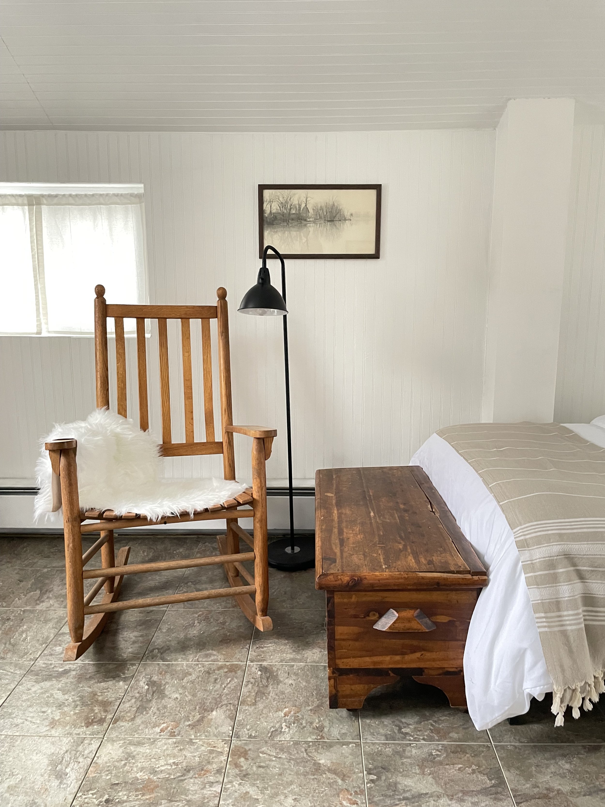
I started by taking note of what was already in the space that we were going to keep. Changing out the flooring and kitchen cabinets would have blown the budget. The walls and ceiling were covered in charming beadboard and of course the place was surrounded by trees with views of the little lake on the property. I rebranded the “studio apartment” to the “guest cottage in the woods” and the design came quickly after that. The cottage would have not only the beadboard but “stone” floors (even if they are vinyl), sink skirts, dark wood furniture and brass accents. The art would be modern but not new (think 1920s modern) and there would be family heirlooms and antiques.
This month we finally finished everything. We spent many hours painting, installing lighting, hardware, scouring thrift stores and their attic for all the elements we needed but in the end it turned out so well. And believe it or not, my parents spent less than $700 on the entire thing!
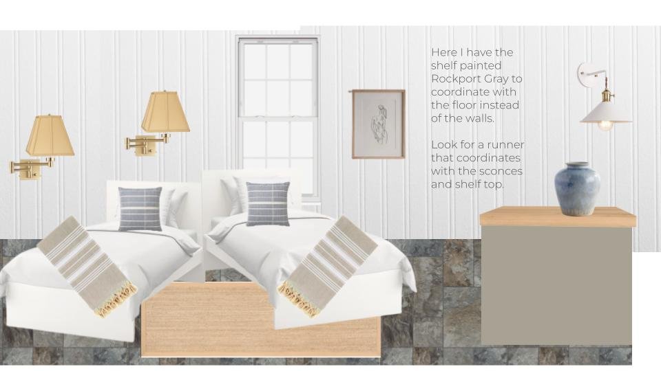
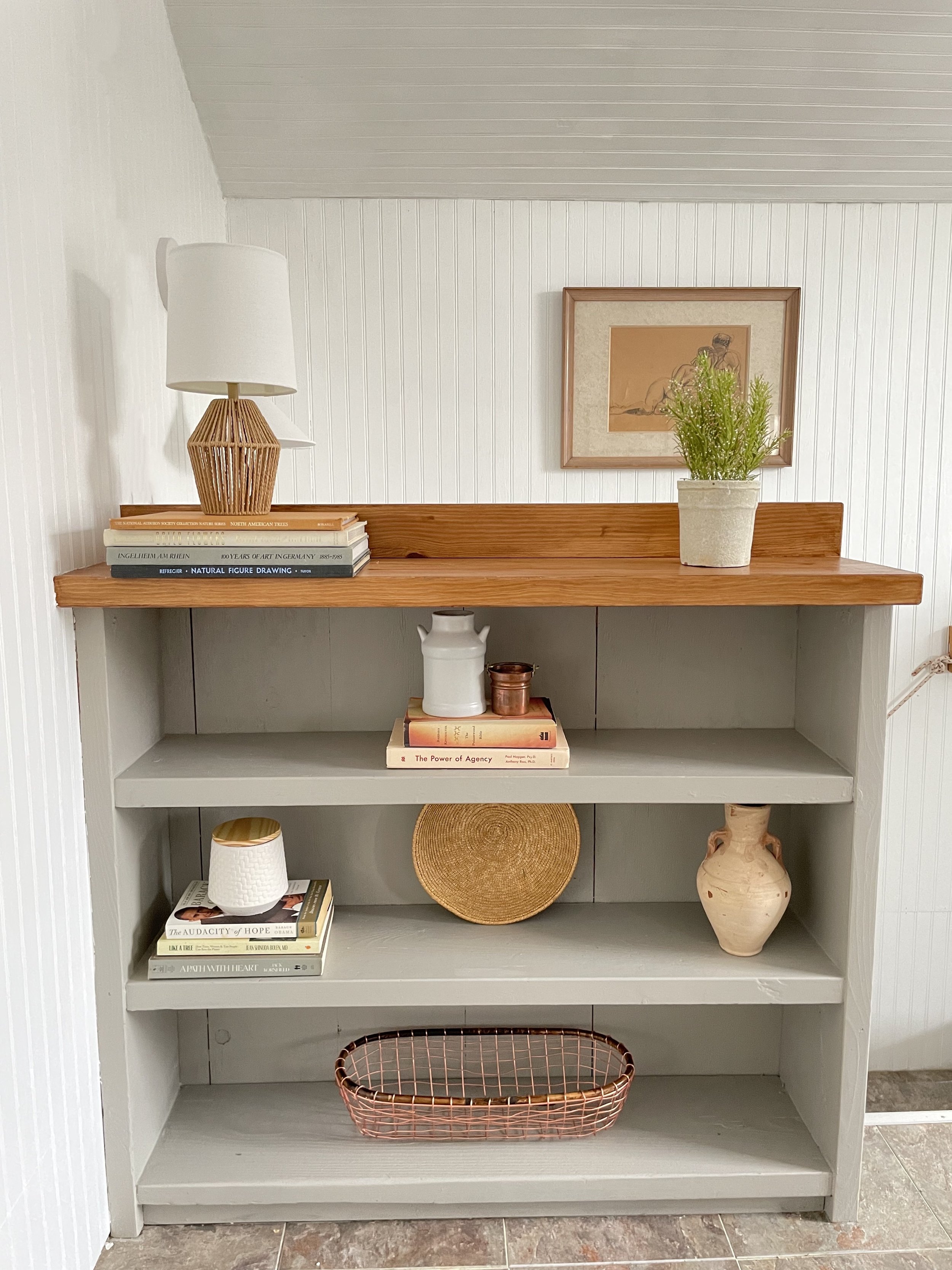
Understanding undertones really saved the day when it came to planning the design for this space. We painted the bookshelf that my dad built out of old stair treads from their main house (which doubles as a stair railing for safety) a green gray (Benjamin Moore Rockport Gray) to coordinate with the floor. The bed throws also coordinate with the floors picking up the green beige tones.
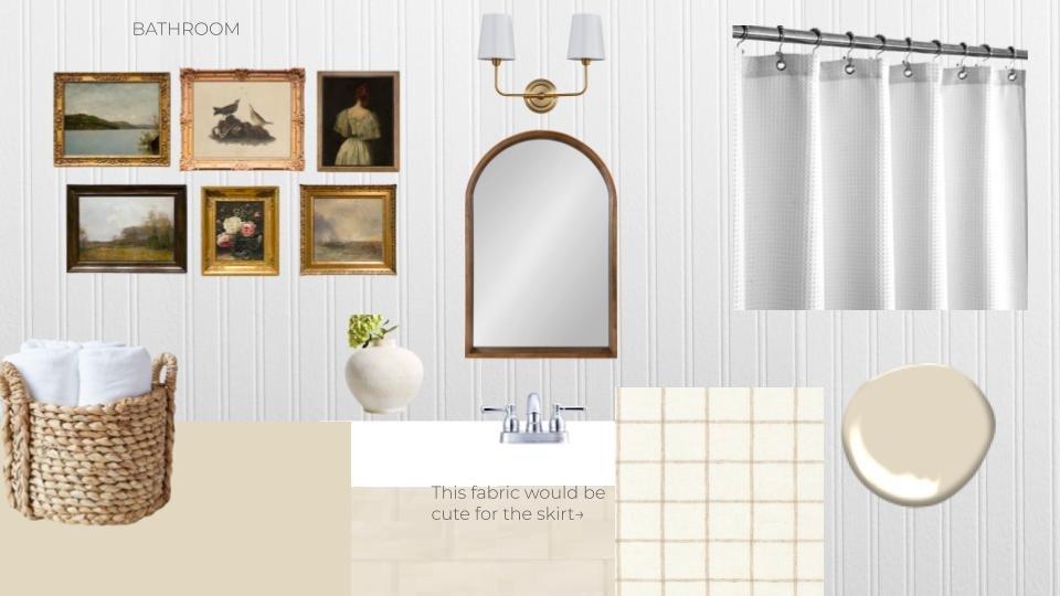
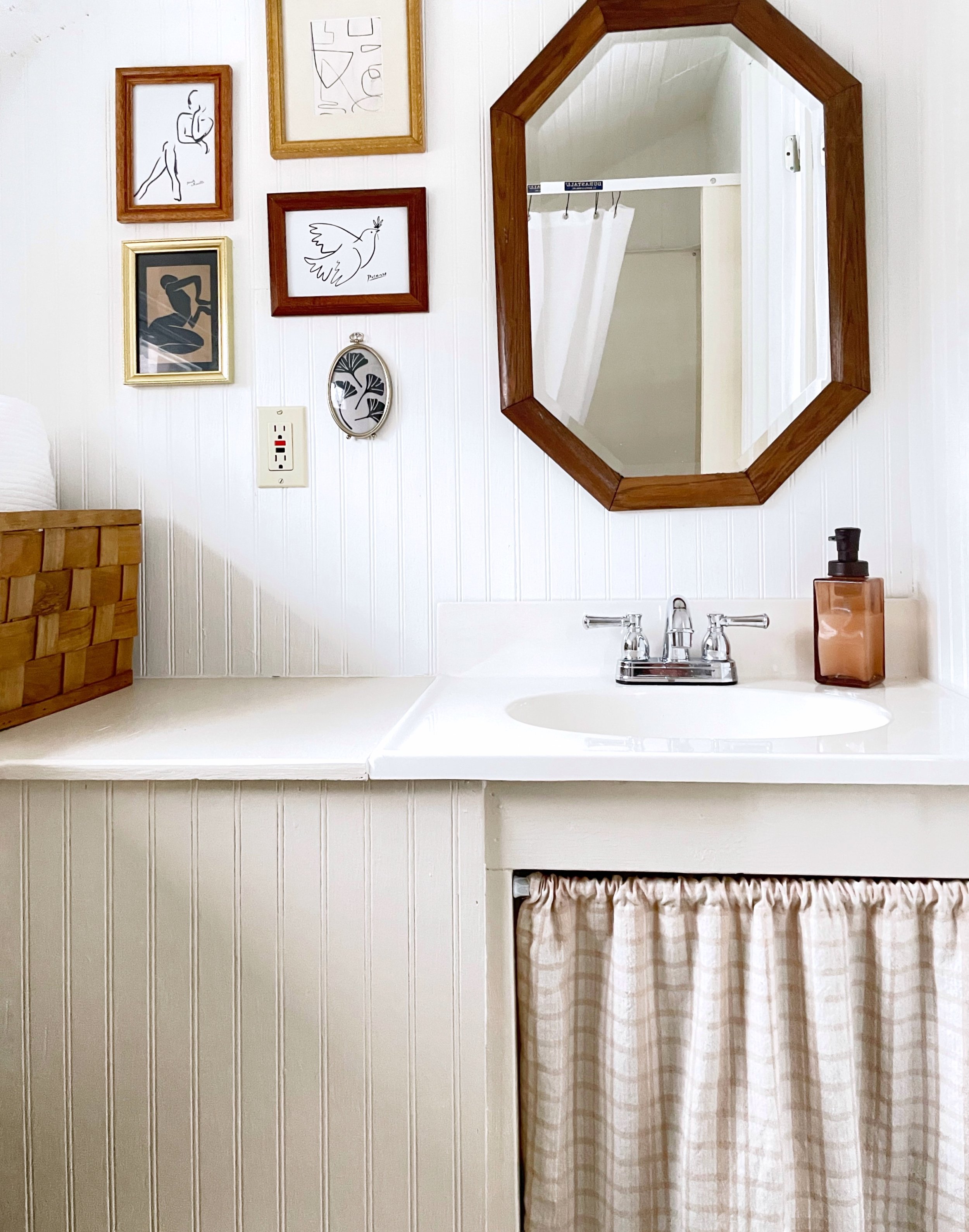
We painted the built-in bathroom vanity a pink beige (Benjamin Moore Muslin) to coordinate with the bathroom vinyl floors and added a pink beige sink skirt as well. New lighting, a new chrome faucet, a thrifted mirror, a new shower curtain and thrifted frames with printed art from Etsy pulled it all together.
Bathroom before.
Bathroom after. Thrifted frames, Etsy curated art, and the right colors.
To choose the best white for the walls, we looked to the kitchen cabinets which we weren’t going to paint. They were a true white, so we painted the walls and ceiling Benjamin Moore Chantilly Lace to match. We also made sure that our linens, faux fur throws and shower curtain were true white.
These color decisions really made the entire design look intentional from the floor up. If we hadn’t incorporated the colors that existed already, it would have looked like we were ignoring older elements and it would have been all wrong.
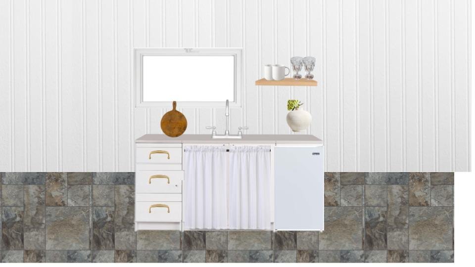
A few other things we did in the kitchen really made a huge difference, like new pulls for the cabinet drawers, replacing the ugly dated wood wall cabinet with a shelf, and skirting the sink to add charm (and hide the air conditioner which is in the window in the summer). A new chrome Delta faucet was a nice update from the builder-grade stainless steel one that was there before and wood decor helps bring some warmth to the white kitchen.
My mom and I did the bulk of the work on this space with some assists from my dad. We are both so happy with how it turned out! I think it’s time to plan for an overnight visit.
I’ve also been sharing some videos of the space on my Instagram account. Come follow me there if you don’t already!
If you have a design dilemma that you’d like my advice on, email me with a photo at info@amyglasscockdesign.com, and I might feature it on this blog!


